4. Data Visualization
The Health Information Systems Performance Monitoring Dashboard (HISPMD) offers two powerful approaches to data visualization: the Advanced Dashboard Builder for creating custom interactive dashboards, and pre-built visualizations for quick analysis. This section provides comprehensive guides for both approaches.
4.1 Advanced Dashboard Builder
The Advanced Dashboard Builder is an interactive tool that enables users to design, customize, and save personalized dashboards with multiple visualization components. This feature transforms complex health data into actionable insights through a flexible, user-friendly interface.
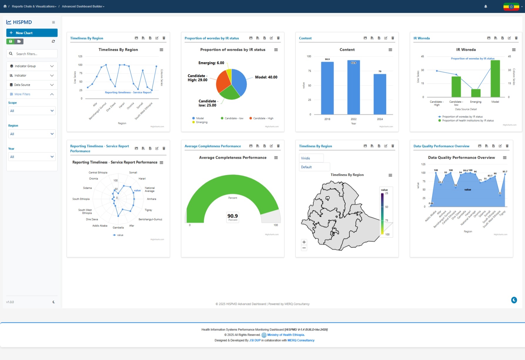
Figure 4.0: Advanced Dashboard Builder
To access the advanced dashboard builder
Go to The left side navigation menu under -> Reports Chats & Visualizations -> Advanced Dashboard Builder as Displayed on the image below.
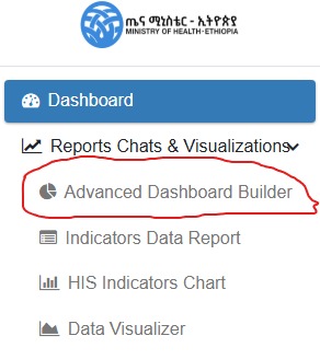
Figure 4.1: Accessing Advanced Dashboard Builder
4.1.1 Key Features and Benefits
- Complete customization - Build dashboards tailored to specific monitoring needs
- Multi-chart layouts - Combine various visualization types in one view
- Interactive elements - Drill down, filter, and explore data dynamically
- Save/load functionality - Preserve dashboard configurations for future use
- Responsive design - Works on desktop and mobile devices
- Export capabilities - Share insights with stakeholders
4.1.2 Interface Overview
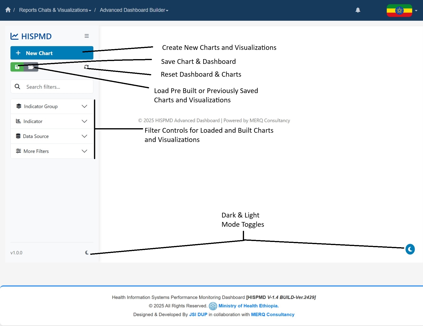
Figure 4.2: Dashboard Builder Interface Components
The interface consists of three main areas:
- Navigation Sidebar (Left)
- Chart creation controls
- Comprehensive filtering options
-
Dashboard management tools
-
Dashboard Canvas (Center)
- Interactive workspace for charts
- Drag-and-drop functionality
-
Real-time preview of visualizations
-
Chart Configuration Panel
- Appears when adding/editing charts
- Contains all customization options
- Live preview of changes
4.1.3 Creating a New Dashboard
Step 1: Add Your First Chart
- Click the "New Chart" button in the sidebar
- The Add Chart modal will appear with configuration options
Step 2: Configure Chart Properties
In the Add Chart modal:
Basic Settings:
- Chart Title: Enter a descriptive name
- Chart Type: Select from 15+ visualization types
- X-Axis: Choose primary dimension (Year, Region, Indicator etc.)
- Y-Axis: Select measurement value (Value, Target Value, etc.)
Advanced Filters:
- Apply filters to focus on specific data subsets:
- Indicator Groups
- Individual Indicators
- Data Sources
- Geographic Regions
- Time Periods
- Facility Types
Display Options:
- Toggle legend visibility
- Enable/disable data labels
- Configure tooltip details
- Set custom sizes of the chart box
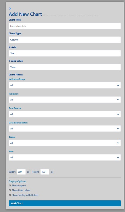
Figure 4.3: Creating New Charts to the Dashboard Builder
Step 3: Position and Resize Charts
- Drag charts to position them on the canvas
- Use the resize handles to adjust dimensions
- Charts automatically snap to grid for alignment
4.1.4 Managing Dashboards
Saving Dashboards
- Click "Save Dashboard" in the sidebar
- Enter a descriptive name (e.g., "Yearly Performance Overview")
- Click Save - configuration is stored for future sessions
Loading Dashboards
- Click "Load Dashboard" in the sidebar
- Select from your saved dashboards
- The system will load all charts and filters from the previously saved parameters and settings.
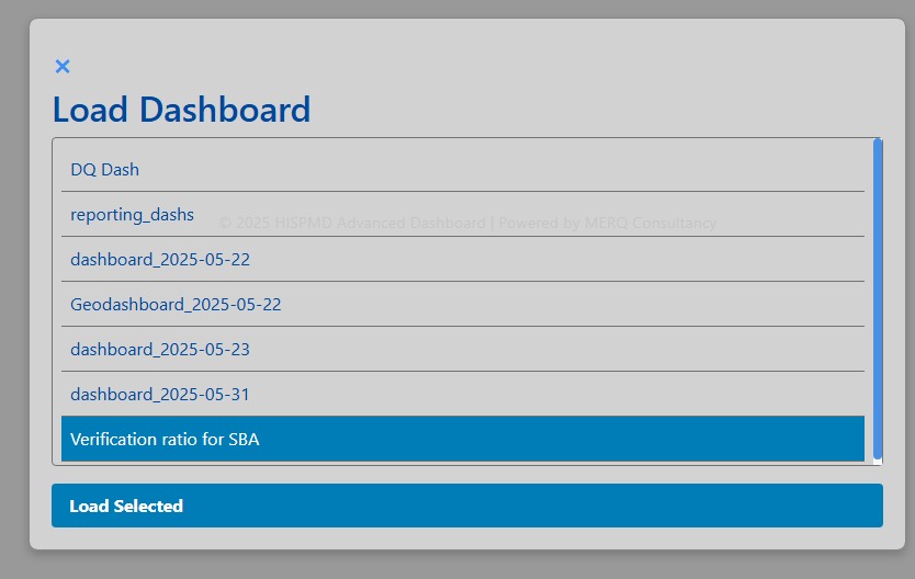
Figure 4.4: Loading Previously Saved Dashboard
Dashboard Actions
- Reset: Clear all charts and start fresh
- Export: Save dashboard charts as Image, XLSX or PDF
- Print: Generate printer-friendly version
- View Raw Data: Display Chart Data as a data table
4.1.5 Chart Types Available
The Dashboard Builder supports these visualization types:
| Chart Type | Best For | Example Use Case |
|---|---|---|
| Column | Comparisons | Facility performance by region |
| Line | Trends | Reporting rates over time |
| Pie | Proportions | Data source distribution |
| Area | Cumulative data | Service coverage growth |
| Stacked Column | Part-to-whole | Indicator breakdowns |
| Gauge | Target progress | KPI achievement |
| Geo Map | Spatial analysis | Regional performance |
| Radar | Multi-dimensional | Facility capability assessment |
4.1.6 Advanced Features
Interactive Filtering:
- Click on chart elements to filter other visualizations
- Use CTRL+Click to select multiple items
- Right-click to clear selections
Data Export:
- Export chart data to Excel/CSV
- Save images (PNG/JPEG) for reports
- Generate PDF summaries
Mobile Optimization:
- Responsive layout adapts to screen size
- Touch-friendly controls
- Simplified mobile menu
4.2 Overview of Pre-built Data Visualizations
For users who prefer ready-made visualizations, HISPMD provides pre-built charts and graphs that transform raw health data into actionable insights. These help users:
- 📊 Identify trends and patterns over time.
- 📍 Compare performance across regions, facility types, and demographic groups.
- ⚠️ Detect anomalies or unexpected variations in health indicators.
- 📑 Generate reports for decision-making and policy recommendations.
4.2.1 Accessing the Data Visualizer
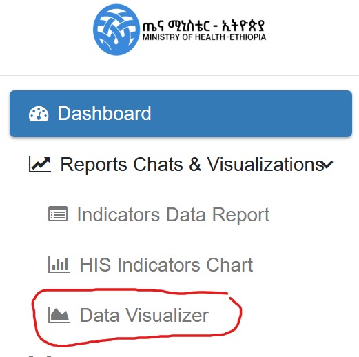
Figure 4.5: Accessing Data Visualizer Menu Item
- Navigate to the left sidebar under the
Reports Charts & Visualizationmenu - Click on
Data Visualizer - The visualization interface will load with default charts
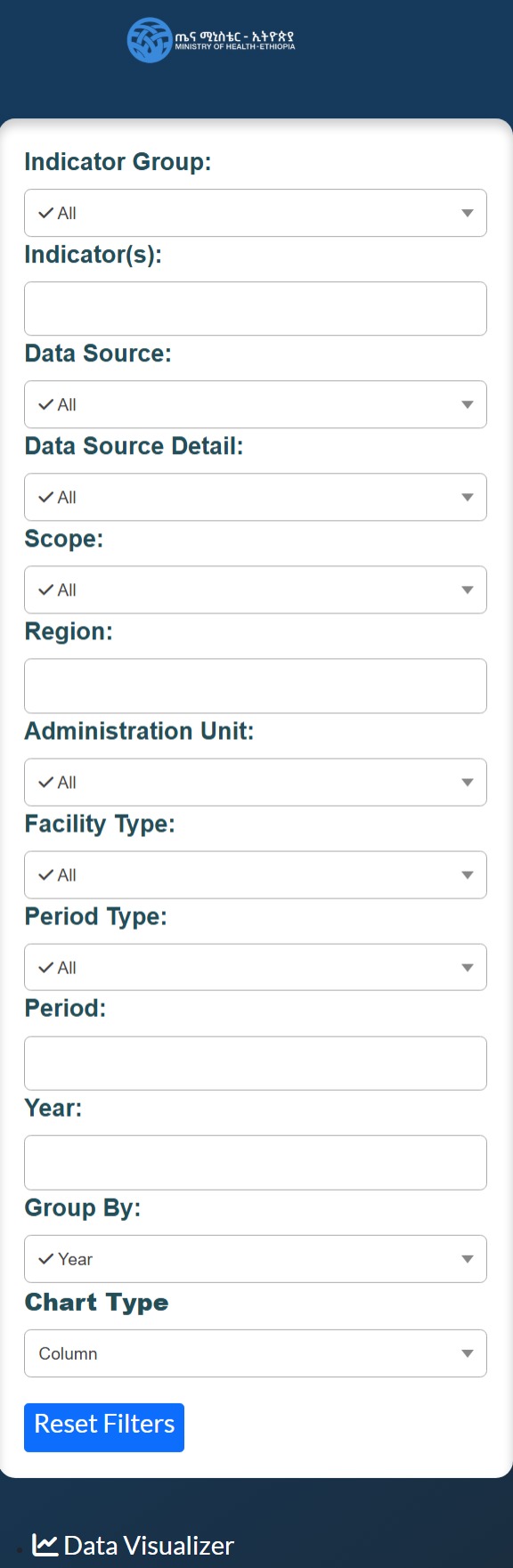
Figure 4.6: Advanced Live Data Visualizer Options
4.3 Types of Visualizations
HISPMD provides several types of data visualizations, each serving a specific analytical purpose.
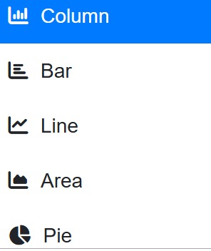
Figure 4.7: Data Visualizer Chart Types
4.3.1 Line Charts (Trend Analysis)
📈 Best For: Analyzing changes in indicators over time 🔍 Example: Tracking reporting rates over multiple years
How to Use
- Hover over data points to see exact values
- Click legend items to show/hide specific series
- Drag to zoom into specific time periods
- Double-click to reset zoom
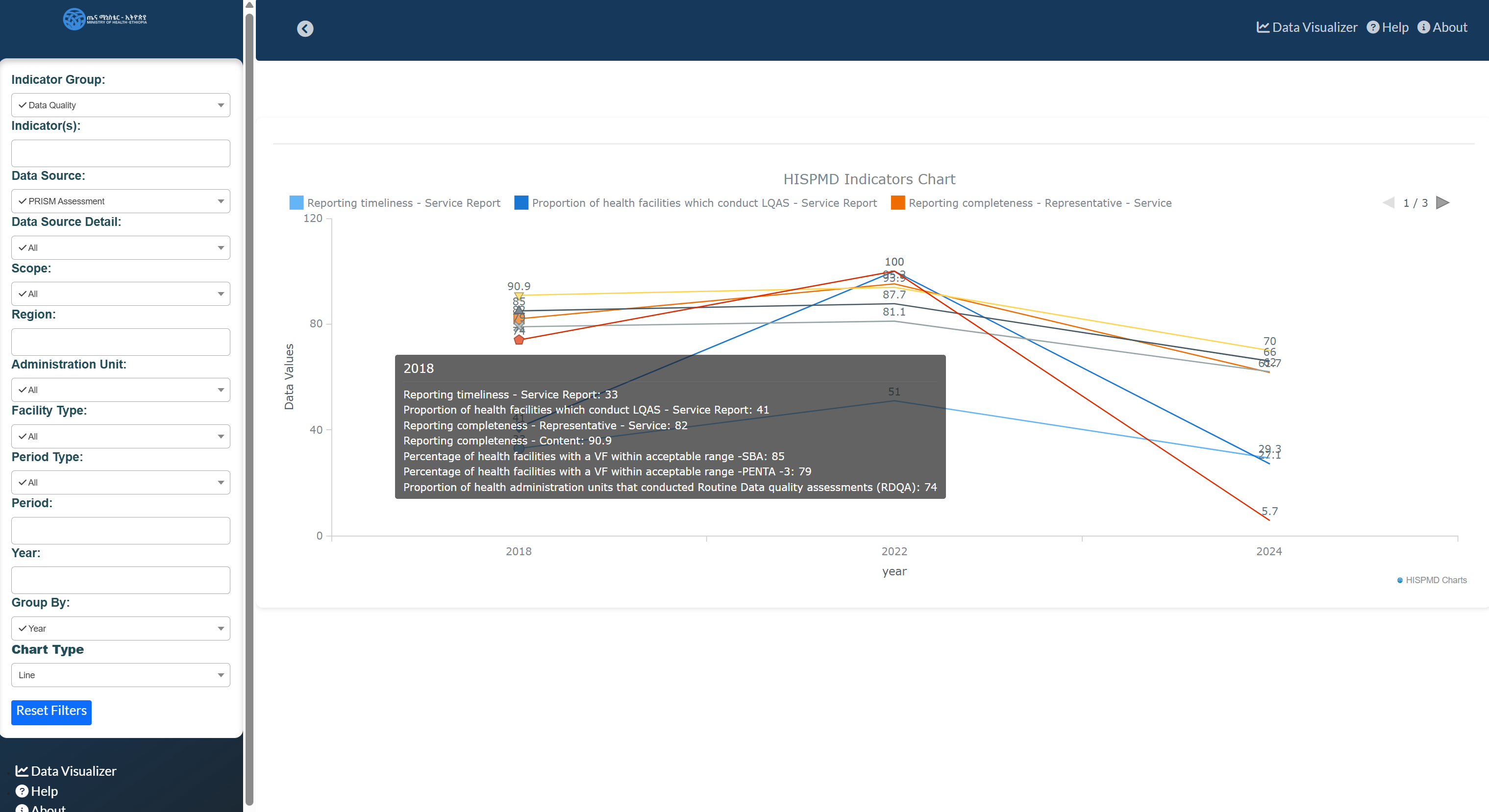
Figure 4.8: Example of Trend Analysis Using Line Chart
4.3.2 Bar/Column Charts (Comparative Analysis)
📊 Best For: Comparing categories within an indicator 🔍 Example: Facility performance by type
How to Use
- Hover over bars for detailed values
- Click to drill down into sub-categories
- Use stacked view for part-to-whole analysis
4.3.3 Pie Charts (Proportional Analysis)
🟢 Best For: Showing distribution percentages 🔍 Example: Data source composition
How to Use
- Hover for percentage values
- Click slices to isolate categories
- Combine with filters for dynamic views
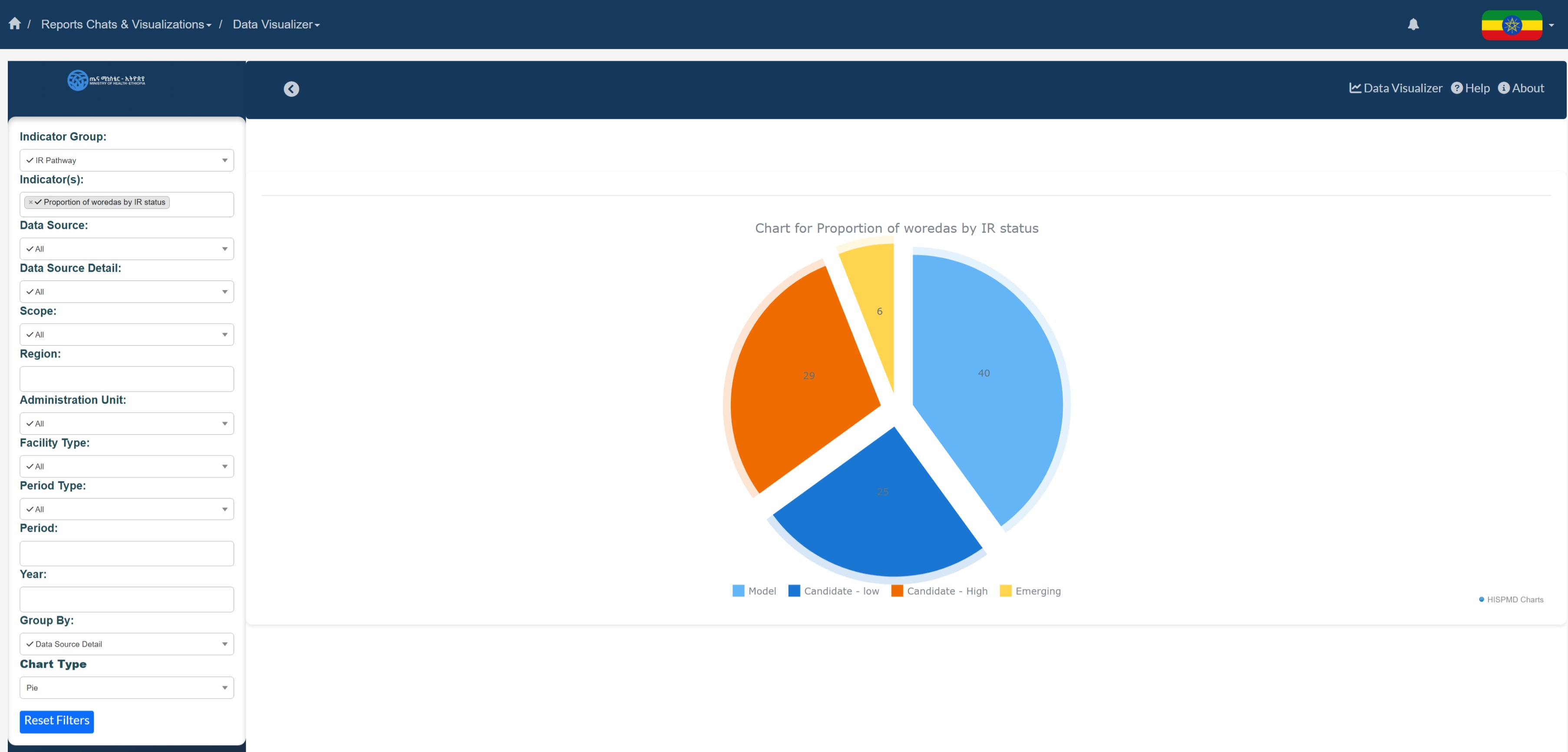
Figure 4.9: Proportional Analysis Using Pie Chart
4.3.4 Heat Maps (Geospatial Analysis)
🌍 Best For: Geographic performance patterns 🔍 Example: Regional coverage rates
How to Use
- Click regions to view detailed data
- Use legend to interpret color scales
- Zoom for higher granularity
4.3.5 Data Tables (Detailed Records)
📑 Best For: Precise value comparison 🔍 Example: Facility-level performance metrics
How to Use
- Sort columns by clicking headers
- Use search to filter records
- Export for further analysis
4.4 Interacting with Visualizations
4.4.1 Common Interactive Features
| Feature | Description | How to Use |
|---|---|---|
| Tooltips | Detailed data values | Hover over elements |
| Legend Toggle | Show/hide data series | Click legend items |
| Zoom | Focus on specific ranges | Drag to select area |
| Drill-down | View sub-categories | Click chart elements |
| Cross-filter | Link multiple charts | Select items while holding CTRL |
4.4.2 Advanced Navigation
Keyboard Shortcuts:
- Arrow keys: Pan zoomed charts
- ESC: Reset all filters
- CTRL+Z: Undo last action
Touch Gestures (Mobile):
- Pinch to zoom
- Swipe to pan
- Tap to select
4.5 Customizing Visualizations
4.5.1 Dashboard Builder Customization
As described in section 4.1, the Dashboard Builder offers complete control over:
- Chart types and combinations
- Color schemes and styling
- Layout and organization
- Filter presets
4.5.2 Pre-built Visualization Customization
| Option | Description | Access Method |
|---|---|---|
| Time Range | Adjust date period | Timeline selector |
| Indicators | Select metrics | Dropdown filter |
| Regions | Geographic focus | Map or dropdown |
| Chart Type | Switch visualization | Chart type selector |
| Color Theme | Change palette | Settings cog |
4.6 Exporting and Sharing
4.6.1 Export Formats
| Format | Best For | How to Export |
|---|---|---|
| PNG/JPEG | Reports, presentations | Right-click → "Save Image" |
| Printable documents | Export button → PDF | |
| Excel | Further analysis | Export button → XLSX |
| CSV | Data processing | Export button → CSV |
4.6.2 Sharing Options
- Direct Link Sharing:
- Generate shareable URLs
- Set expiration dates
-
Control access levels
-
Embed Codes:
- HTML snippets for websites
- Responsive iframes
- Auto-updating data
4.7 Using Visualizations for Decision-Making
4.7.1 Practical Applications
For Program Managers:
- Identify low-performing facilities
- Track intervention effectiveness
- Allocate resources strategically
For Health Officials:
- Monitor system-wide performance
- Detect emerging trends
- Benchmark regional performance
For Partners:
- Verify program impact
- Demonstrate accountability
- Support funding requests
4.7.2 Best Practices
- Start with Key Questions:
- What problem needs solving?
- What data answers this?
-
Which visualization shows it best?
-
Use Appropriate Chart Types:
- Time trends → Line charts
- Comparisons → Bar charts
-
Distributions → Pie charts
-
Apply Smart Filtering:
- Focus on relevant time periods
- Compare similar facilities
- Isolate priority indicators
4.8 Summary of Key Features
| Feature | Dashboard Builder | Pre-built Visualizations |
|---|---|---|
| Customization | Full control | Limited options |
| Chart Combinations | Multiple per dashboard | Single views |
| Saving | Save full configurations | Save individual charts |
| Learning Curve | Moderate | Easy |
| Best For | Ongoing monitoring | Quick analysis |
🚀 Next Section: Learn how to generate detailed reports in Section 5: Report Generation & Exporting
📌 Pro Tip: Combine both approaches - use pre-built visualizations for quick insights, then build custom dashboards for ongoing monitoring of key metrics.